Here’s a problem that doesn’t get talked about enough in genomics: the gap between having data and understanding it.
The MSK-IMPACT dataset, the result of tumor sequencing from more than 10,000 patients across 58 unique and 359 detailed cancer types, published in Nature Medicine in 2017, represents years of clinical and computational work by roughly 100 collaborators. The figures in that paper tell a lot of that story visually: which cancers were most common, which genes were most frequently mutated, how mutation burden varied across tumor types, and many other aspects.
Recreating those figures from the raw data, as a validation exercise, is not trivial. It requires knowing which data fields to use, how to aggregate them correctly, how to handle edge cases (patients with multiple cancer types, for instance), how to recode values so they match the original paper’s categories, and how to format a chart so it’s both readable and comparable to the original.
A bystro AI white paper recently documented what happens when you try to do all of that using plain language prompts in bystro THiNK — no custom code written in advance, no scripts to debug, just clear instructions in English. A previous blog post addressed the fidelity of data aggregation from source files to a master data table. Here we extend the benchmarking study further, into the visualization of relationships between patients, cancers, and mutations.
The question was direct: Starting from the same raw data and working from plain language instructions, can an AI assistant produce visual representations of data that are similar to those in the original manuscript and ones created by a skilled human analyst?
The publicly available MSK-IMPACT dataset on cBioPortal consists of 77 files totaling 63.4 megabytes of data. Four primary files were used: clinical sample data, mutation data, copy number alteration (CNA) data, and structural variant (SV) data — collectively containing over 12 million individual data points.
Creation of the master data tables by a human analyst and by bystro THiNK is covered in detail in the original white paper. The data aggregation aspects are also described in the first blog post in this series.
For this study, manuscript Figures 2a, 2c, 5a, and 5b were selected for replication because they are “self-contained”, meaning that no data external to the study were required to generate them. Effort was made to match the overall style and layout of the figures to simplify visual comparison. Manual analysis was done using Excel, and in the case of the violin plots in Figure 5c, the python seaborn library. bystro THiNK figure generation used a series of natural language prompts to create and refine the look of each figure. In the case of multi-panel figures, for instance, the pie chart and the stacked bar graph of Figure 2a, each panel was created independently and then joined externally. Sample prompts appear in the Outcomes section.
Figure 2a: Drawing a Pie Chart for 10,000 Patients

The first target was Figure 2a from the original manuscript, a pie chart showing the distribution of cancer types across the study population.
This sounds simple. It is not. A naive count of cancer types would double-count patients with multiple tumor types. The “Other” category needs to group all cancer types below a patient count threshold. The sections need to be ordered, labeled outside the slices, and positioned so the chart reads naturally. The color scheme needs to match the original.
Here is the exact prompt used with bystro THiNK:
“Using the attached clinical data, please create a pie chart that shows the number of patients with each cancer type and an ‘Other’ category that contains all cancers with affected patient counts less than 180. Patients with multiple samples should be de-duplicated. Pie sections should be labelled outside of the section with cancer type and the count in parentheses. Please order the pie sections in order of decreasing counts in a counterclockwise direction and place the boundary between the adjacent ‘Other’ and ‘Non-Small Cell Lung Cancer’ categories at the 3 o’clock position.”
To match the color scheme used by the original authors, a table of data series names paired with HTML color values was uploaded, and bystro THiNK was prompted to recolor the plots according to that scheme.
The resulting figure was visually and numerically equivalent to the manually produced version, with the expected minor differences from the published original that reflect the pre-specified exclusion of 30 patients with conflicting cancer type records, a decision that shifted any individual count by less than 1%.
Figure 2c: A Gene Mutation Frequency Heatmap

The next target was considerably more complex: a heatmap showing how frequently specific genes are altered across different cancer types — one of the signature figures of the MSK-IMPACT paper.
This figure required constructing a frequency matrix from merged mutation, copy number, and structural variant data, filtering to genes that met either a cohort-wide alteration threshold (5% or more across all patients) or a cancer-type-specific threshold (30% or more within a given cancer type), and then rendering that matrix as a color-scaled heatmap with the right orientation, labels, and color range.
The prompt used for the final heatmap conversion step was:
“Please convert the gene_cancer_frequency_filtered table to a heatmap where the minimum value has the rgb color (255,255,255) and the maximum value has the rgb color (38,29,17).”
Intermediate steps — building the frequency table, applying thresholds, filtering gene and cancer type lists — were handled via earlier prompts in the same session.
One notable finding: the data series labeled “Hepatocellular Carcinoma” in the manuscript’s heatmap does not appear as a named cancer type in the primary data file at all. Neither the manual analysis nor bystro THiNK included it in their reproductions, because it simply was not there to count. Bystro THiNK was correct to exclude it and flag the absence during analysis — exactly the kind of data consistency check that a human analyst might miss under time pressure.
Figures 5a and 5b: Tumor Mutation Burden, Two Ways
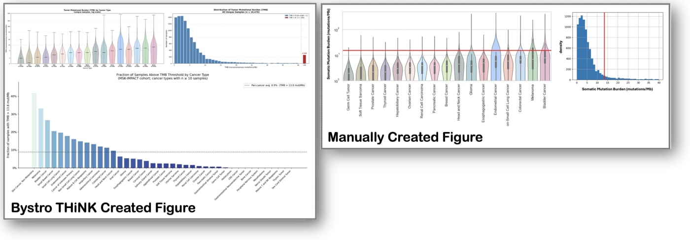
Tumor mutation burden (TMB) — the number of non-synonymous mutations per megabase of sequenced DNA — is a clinically important metric that varies widely across cancer types and correlates with immunotherapy response. The MSK-IMPACT paper includes two figures summarizing TMB across the dataset.
Figure 5a is a violin plot showing the TMB distribution for each of the major cancer types in the study. The prompt used with bystro THiNK was:
“For the cancers in the attached CANCER_LIST file, create a violin plot showing the distribution of TMB values using the data for unique sample IDs from the master_data_table_with_clinical file. Transform the y-axis to log scale between 1 and 500. Series labels on the x-axis should be in the same order as in the cancer_list file.”
The resulting violin plots were visually similar to both the original manuscript figure and the manually produced version, with the expected differences in exact graphical styling.
Figure 5b is a frequency histogram of TMB across all tumors, used in the original paper to establish a threshold of 13.8 mutations per megabase as the cutoff for “high” mutation burden.
In its replication, bystro THiNK didn’t just reproduce the histogram, it independently derived the statistical basis for the published threshold:
TMB median + 2 × IQR = 3.91 + 2 × (6.85 − 1.96) = 13.7The published threshold was 13.8. The slight difference (13.7 vs. 13.8) is consistent with minor differences in the sample set being analyzed (the white paper excluded 30 patients from the study’s primary data). Using that threshold, bystro THiNK identified 902 samples, 8.9% of all samples, as having high mutation burden, and further noted which cancer types drove that signal: Skin Cancer (Non-Melanoma), Melanoma, and Bladder Cancer had the highest fractions of high-TMB samples. Ten cancer types — including CNS Cancer, Mesothelioma, and Bone Cancer — had zero samples above the threshold, reflecting their inherently low baseline mutation rates.
The histogram prompt:
“…Also create a frequency histogram using all TMB scores for unique samples, capping the x-axis at TMB>40, creating an additional >40 bin.”
Ultimately, what the visualization exercise demonstrated was that the figures bystro THiNK produced were not approximations or plausible-looking stand-ins. They were numerically equivalent to the manually produced figures, grounded in the same underlying data, and consistent with the same analytical decisions. Where the figures diverged from the published manuscript — as with the missing cancer types or the slightly different patient counts — both the AI-generated and manually generated versions diverged in exactly the same direction and for the same reason: they reflected what was actually in the data.
It followed the data just as a human analyst would. That’s what accurate analysis looks like.
It’s worth being clear about what the process does and does not involve.
For the most complex multi-panel figures (like the pie chart comparison and grouped bar representations of cancer type counts), individual panels were created separately using bystro THiNK and then assembled manually into the final composite image. The AI handled the data processing and individual chart generation; the final layout assembly was done by the analyst. This is a realistic reflection of how these tools work in practice: they handle the computationally intensive, error-prone steps, and leave the final editorial and layout decisions to the human.
What is genuinely notable is how much analytical work was performed through plain language instructions alone — work that would otherwise require scripting in Python, R, or a specialized visualization library. The violin plot required a log-scale y-axis transformation. The pie chart required patient deduplication, dynamic threshold-based category grouping, precise label positioning, and custom color matching. The heatmap required a multi-step frequency matrix calculation before any visualization occurred. None of that required the analyst to write or debug code.
For research teams that include members without deep programming expertise such as clinicians, clinical coordinators, junior trainees, that distinction matters. Not because the code is inherently inaccessible, but because eliminating the translation step between “what I want to see” and “what I need to write to see it” genuinely accelerates the research cycle. When you understand the data, you can immediately plan your next steps. Doing that efficiently means staying at the forefront of research in your field.
Complex scientific figures have historically required either deep programming and statistical expertise, expensive software licenses, often both. The exercise documented in this white paper demonstrates that a carefully instructed AI platform can generate publication-comparable scientific visualizations from multi-file clinical genomics data, using plain English, while maintaining the analytical rigor expected in peer-reviewed research.
Read the full white paper here.
